Hi, everyone! You might have noticed my inactivity lately. However, I am always trying to find time to post something worthy and related.
I have been working with an architectural company for a couple of months now. We are doing architectural visualization for a variety of clients - local and abroad. My main responsibilities include: shading, lighting, secondary modeling, secondary texturing, scene composition, animation, and compositing. Some time last week, we decided to show the community what we have been doing and to gather constructive criticisms regarding our renders.
We recently finished the setup for our latest project and it's now currently rendering on the farm. However, we wanted to get ask for your honest feedback regarding our output and will possibly apply them on the next projects to come.
Most of the of the lighting schemes and color balancing you will see are a collective decision of the team, so I could not simply inject my own style to the renders (which you might notice later on). But I'm happy that at times, I can get out of my comfort zone and follow the themes that the higher-ups wish to see. That would mean I wasn't able to play around much in post to add edgy color grading, vignetting, depth of field, etc. That would probably come in the future personal projects that I'll be doing myself. Everything is rendered with Blender 2.5's Internal Renderer.
Pardon me, I had to attach a watermark to the images just to stay safe. Click them to see a larger image. ;)
Anyways, enough rambling and more pictures (we need your constructive criticisms):
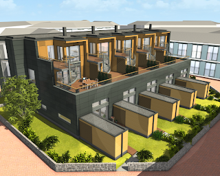
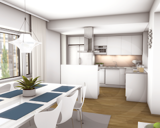
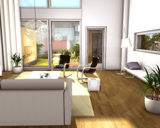
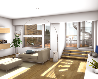
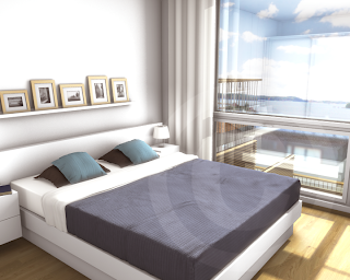
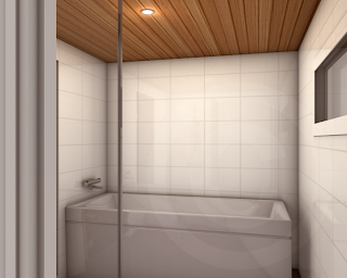
This latest archi animation project was the one we struggled most with, probably because we hadn't planned well earlier in advance. I was very much itching to colorize and add at least depth of field but I guess they won't let me. ;) Personally, I think the images look too bright. But I'll leave that up to you to judge.
Below is one of our earlier projects, with a slightly different lighting rig.
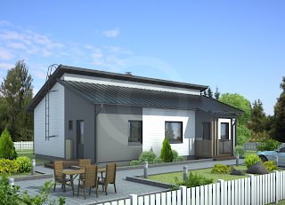
Let us know what you guys think. ;)
-Reyn
15 comments:
Those look very cool! You did a good job in Blender internal. Lighting is pretty good in general. The images are not extremely realistic, but it seems to be OK. Good job overall :)
Thanks, Andreu. I just wish I could raise it up a notch and tweak the colors more (at least) to make it look more natural. But I guess it's too late for that now since rendering is done and the deadline has to be prioritized. ;)
Thanks for the input.
-Reyn
If you can afford it as a company, an extremely effective renderer is Octane Render. It's unbiased, bounces light extremely realistically, and uses nVidia's CUDA to render using the GPU, making it around 15x faster in render time.
If you end up using Octane, you generally won't have to worry about getting materials absolutely perfect, like I've experienced in the internal. All it takes is a texture and Octane will get lighting and shaders down pretty well on its own.
As for specific pictures in your post, the rooms draw my attention specifically. It looks almost as if you included ambient occlusion on the wall materials. I don't feel like the corners would occlude as much as they show here, so it may help to tone it down just a bit. Especially in your second and third internals, there is more indirect lighting due to the white tables, carpets, et cetera that will illuminate (quite literally) every nook and cranny in your scene.
Aside from that, the reflections add a nice touch, the organic materials look pretty damn good, and the architectural design itself looks magnificent. I would definitely buy one of these houses. Shadows behave predictably based on the distance from their casting objects, such as the skylight in the third image.
Hope this helps to some degree; happy materializing!
The Portalist: Thank you so much for that wonderful and compound comment. I have to agree with you on the AO part, I think I was stuck to using the full multiply effect where I could have reduced it somehow to a subtle and reasonable level. That way, I could've tweaked the light and shadows better instead of resulting in clipping of highlights.
Thanks so much!
The renders are really impressive and clean...
In archi visualization it seems they don't put DoF coz the more important is what's in there, it's not a movie or cinematic. But if you want to add a little artistic sense and a little "effect" explain it to your boss why do you need the "DoF" effect.
yeah and the deadline too is the most prior.
archi visualization in blender, if would suggest if you knew about http://www.blender3darchitect.com/
for more technique in using blender architect.
Did you use Global Illumination here or HDR? I think that will decrease too much AO on your render.
I agree with AO, it can look "dirty" if over used. I have struggled a lot trying interiors rendering but I'm still new to Blender. You could try next time to have some color in the AO pass, like a light blue for example to pretend is secondary light from the sky. Or other colors to simulate color bounce from a floor or else. From my tries, I ended up having the AO pass rendered separately and compositing it later. Some times even 2 or 3 different AO passes, one really wide and other smaller ones. Usually the pure black one I make it really small, and use it to just add contrast to objects outlines.
I agree with AO, it can look "dirty" if over used. I have struggled a lot trying interiors rendering but I'm still new to Blender. You could try next time to have some color in the AO pass, like a light blue for example to pretend is secondary light from the sky. Or other colors to simulate color bounce from a floor or else. From my tries, I ended up having the AO pass rendered separately and compositing it later. Some times even 2 or 3 different AO passes, one really wide and other smaller ones. Usually the pure black one I make it really small, and use it to just add contrast to objects outlines.
try cycles!!
The kind of photo I would go for is http://www.flickr.com/photos/dawilson/4471426431/ There's bumps and dirt here and there. Slight usage of grunge textures would work wonders in these renderings. Also, as you noted, some of those look like the sun is in the room with you. To me, the third image almost looks like it's outside. Just some thoughts...
siraniks: Thanks for the input. Yeah, I constantly visit Allan Brito's site for tidbits of helpful info. I wasn't able to use 'real' GI in Blender since as of this writing, there's no actual GI yet. I also didn't use HDR (HDR lighting) since that would dramatically increase the render time, given the very noisy output even at high samples.
I did however, use raytraced AO, but stubbornly set it to 1 - which I shouldn't. I agree with The Portalist comment above regarding AO.
Thanks so much, siraniks. Very helpful indeed. ;)
-Reyn
Thanks for the tips, Andz. Rendering AO in passes will definitely help in further tweaking instead of rerending the scene with all settings in place.
Thanks! ^_^
-Reyn
Jikz: I would love to! But I believe it is not production-ready yet for us to risk. And it is still missing some texturing features which we are heavily relying on.
But who knows, in a couple of months, there might be some surprising changes that we might take in into consideration.
Thanks, pal. ;)
-Reyn
Garrett: Thanks for the link. I would love to have that same kind of feel too - soft contrast and lots of color variations playing around, plus a bunch of discolorations and man-made textures here and there.
I will definitely propose these stuff to our workflow. Thanks, Garrett. ^_^
-Reyn
Why not using a Sun as a light, it will make your shadow or AO become bluish rather than black.
Then use Environment Lighting set to Sky Texture.
But yeah as you said that it will increase the render time on high samples.
A little tips on rendering Environment Lighting on Sky Textures for test rendering - Turn off anti-aliasing :) anyways gud luck on your archi visualizations
Nice renders! I have recently started a blog dedicated to architectural renders. Please check it out when you have the time :)
http://architecturalrenders.tumblr.com/
Thanks!
Post a Comment